User Experience and Ergonomics

How Is XR Designed? User Experience and Ergonomics in Virtual Design
In the previous entry of our blog series “Beyond the Edge of Reality”, we focused on the design of graphical elements and user interfaces. In this part of the series, we take a closer look at designing the entire experience of an XR application. Onboarding, storytelling, and ergonomic aspects play a key role in this process.
“One of the biggest challenges of AR compared to traditional 2D demonstrations is the creator's inability to control the camera.”
– Michael Flarup, Danish game designer and entrepreneur
Shift in Perspective
Arguably the most significant difference between XR applications and 2D screen applications is the shift from an observer’s view to the “first-person perspective.” This gives the user partial control over how objects are displayed – making the design of virtual experiences both exciting for users and designers and at the same time a challenge for the latter. It’s also important to remember that holographic technologies and applications are still unfamiliar to a large part of the population, making simple explanations for how to use them essential. That’s why, before designing XR applications, we should clearly consider the following points:
- What is the goal of the application?
- What needs to be done (by the user) to achieve this goal?
- What should not happen, and what problems might arise?
- What are not goals of the application?
Once these questions are defined, we can begin to explore how to achieve these goals and ensure that the user doesn’t get lost during the experience.
Onboarding, Storytelling and Orientation in XR Applications
Orientation is a central theme in XR applications. It begins with the onboarding process. Users should be quickly and easily guided on how to use the technology, what tasks they are expected to complete, and how the XR application will assist them in doing so. It's equally important to explain, right from the start, how to navigate within the application — including what gestures to use and whether voice commands are available.
With regard to orientation within the workflow itself, a coherent concept should be in place that guides users through tasks and provides cues about where the next step needs to happen. Small micro-animations can be extremely helpful in this process. They assist in explaining how to handle tools and complete tasks, give hints about the location of tasks, and indicate whether the user's actions have been successful. In XR applications, animations are far more than just a visual gimmick — they provide a playful touch and the necessary orientation within the dynamic environment of physical reality.
Ergonomics in XR Design
When combining virtual elements with the real world, certain guidelines must be followed to ensure the experience feels “natural” to the viewer. The field of view and focal range play a crucial role in this.
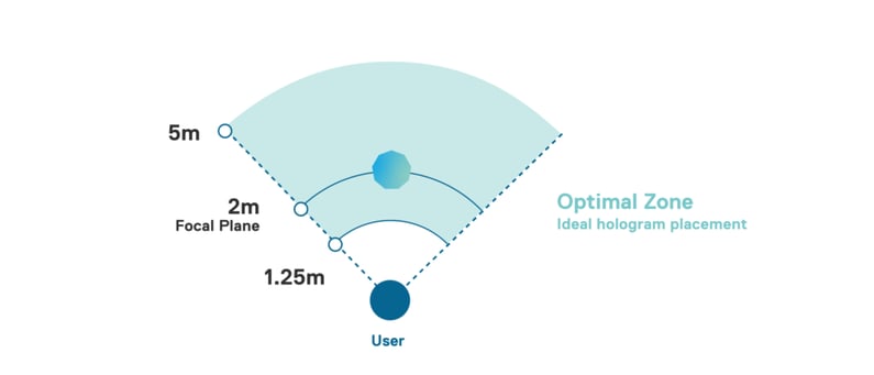
Holograms only feel “real” when their placement is integrated into the user’s natural field of vision. For example, with a Microsoft HoloLens, the optimal positioning for holograms is within a 2-meter focal plane. Any virtual elements placed closer than one meter tend to be perceived as distracting or uncomfortable by the viewer.
Ergonomics also become a topic when it comes to designing gesture control and its use in XR applications. With the advancement of technologies, the range of gestures that can be used is constantly increasing, but unfortunately, this also increases the risk of tiring out the user too quickly with excessive gestures.
Extensive gestures, like those we see in movies such as "Minority Report," are far too exhausting for real users in practice. Smaller movements often provide the better experience. The higher the user must raise their arm to perform an interaction, the faster that interaction should be to avoid fatigue. In particular, movements where the elbow loses contact with the body should not be used too frequently or in succession, as they quickly lead to fatigue.
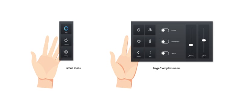
Ergonomics in terms of information density
Movies like “Iron Man” are not particularly recommended as inspiration for industrial control interfaces. Complex buttons may look spectacular in movies, but in practice, they would overwhelm the user when completing tasks. When designing controls, we should help users focus on what is essential. A simple menu structure and straightforward representation of the controls best serve this purpose. Here, we follow the same approach as when designing on-screen applications – reducing to the essentials.
A preview of the upcoming episodes
With the first three parts of the blog series "The Edge of Reality," we have provided an overview of existing technologies and offered initial practical tips for designing XR applications. In the next two parts, we will delve into practical examples of the application of XR technologies in industry.